Security and network overview
The Dashboard page is the primary landing page when you log in to Corelight Investigator. It provides a high-level summary of network activity based on data coming into Investigator from your sensors.
By default, the page displays the Security dashboard, which prioritizes compromised network devices (Entities) over individual alerts. The Highest-risk Entities panel at the top of the page serves as your primary workspace and the launchpad for the Entity Workflow. The lower half of the dashboard provides a broader view of your network’s threat landscape, including an interactive MITRE ATT&CK Map and trend summaries.
Use the tabs at the top of the page to navigate between specialized views, such as Threat Hunting, Network Overview, or Security Posture.
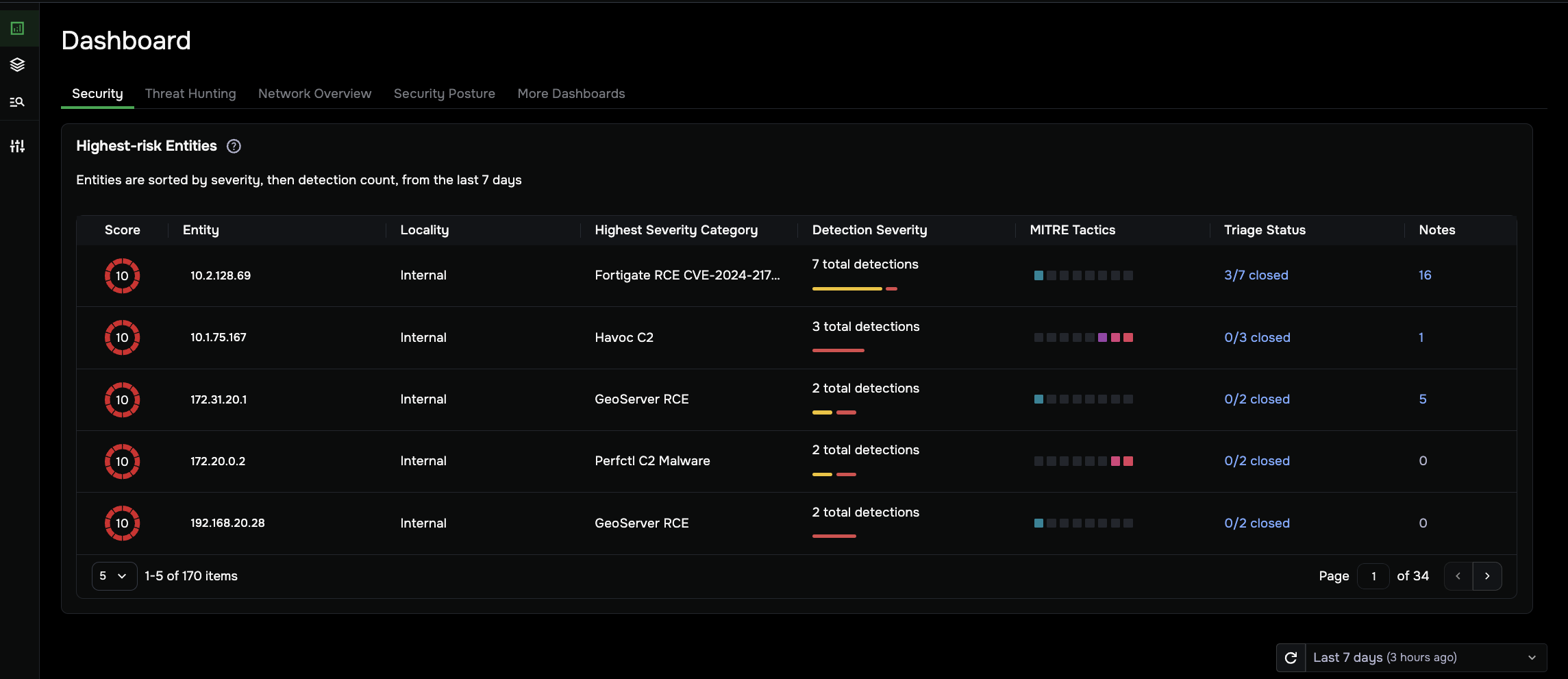
Highest-risk Entities
The Highest-risk Entities panel is the starting point for the Entity Workflow in Investigator. It organizes your work by grouping alerts around specific devices (Entities) so you can focus on the most dangerous threats. This list ranks devices based on activity from the last seven days.
Prioritize by Score: Each entity has a detection severity Score (1–10) based on its most severe open detection. Start with scores 9–10, which indicate high-risk threats like ransomware or Command and Control (C2) activity.
Launch Investigations: Click on any Score or IP address in any row of the Highest-risk Entities panel to open the Entity Overview. This is where you can verify the device’s role on your network and review its activity timeline for forensic evidence.
Manage Triage: The Triage Status column shows how many detections for that entity are still open. When you close all open detections, the entity is removed from this active list and its risk score is reset for the next 24-hour cycle.
For a step-by-step guide on resolving these threats and more information about how to use the Highest-risk Entities panel, see the Entity Workflow topic.
Analyze network-wide threat patterns
The bottom half of the dashboard uses the MITRE ATT&CK Map and trend widgets to help you understand your broader attack surface and threat trends. By default, these panels display data from the last 7 days, but you can adjust this time interval in the upper-right corner to focus your analysis.
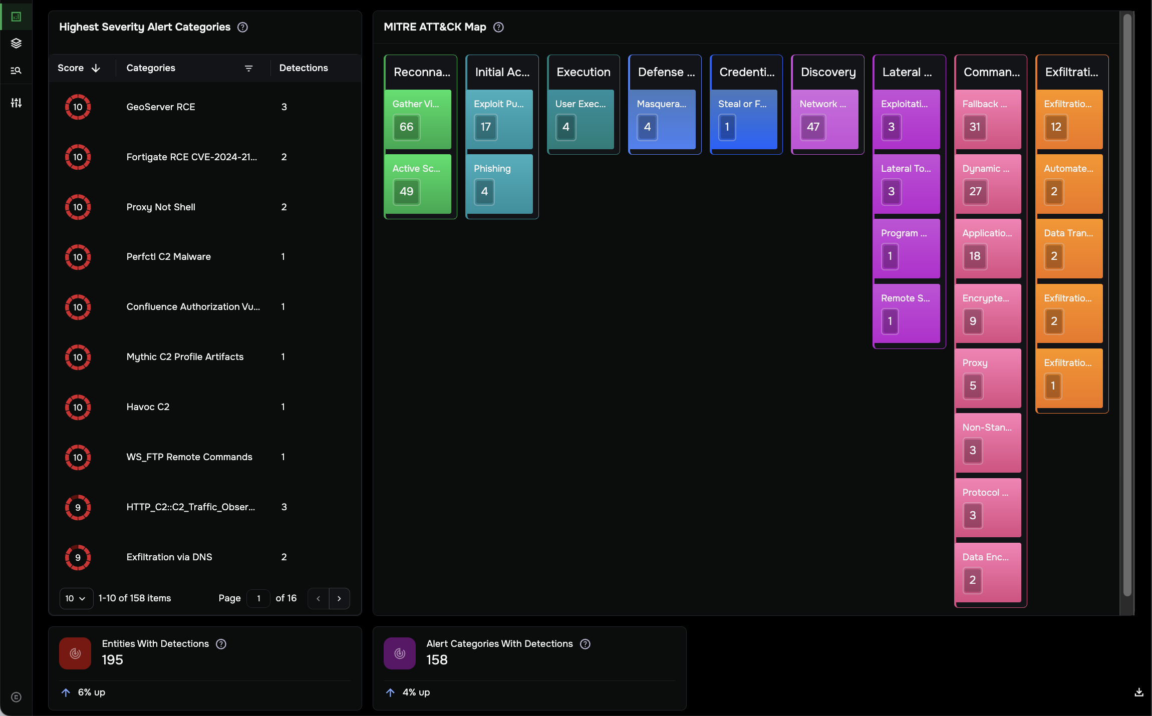
MITRE ATT&CK Map
This interactive heat map aligns security alerts with MITRE ATT&CK tactics, techniques, and procedures. The framework shows how attacks evolve through an enterprise.
Observe Tactics: Review color-coded blocks for stages like Reconnaissance, Initial Access, or Exfiltration.
Filter Dashboard: Click any tactic or technique block to filter the entire dashboard by that specific attack stage.
Entity Counts: For active scanning alert categories, a number in the bottom-right corner of each block shows how many unique entities were found for the category.
Highest Severity Alert Categories
This panel displays the specific alert categories with open detections and their severity score. Use this to identify widespread threat types, such as Havoc C2 or Ransomware, currently triggering alerts across multiple hosts.
Network trends & totals
Entities with Detections: Displays the total number of unique IP addresses and domain names flagged with a security alert (includes both open and closed detections).
Alert Categories with Detections: Displays the number of distinct detection types identified in the specified time interval.
Trend Indicators: Percentage changes (for example, 6% up) show whether threat volume is increasing or decreasing compared to the previous time window.
Explore other dashboards
Use the tabs at the top of the page or the More Dashboards menu to explore different data perspectives:
Threat Hunting: Shows a curated set of hunt queries organized by category. Use the vertical ellipse to pivot directly to events.
Network Overview: Answers essential questions about network technologies, core services (DNS, SSL), and bandwidth measurements.
Security Posture: Provides high-level insight into your cybersecurity readiness, including SSH, DNS, and Remote Activity Hygiene indicators to track the health of encrypted traffic and authentication attempts.
More Dashboards: Access the full library of available Investigator dashboards or create a new custom dashboard to fit your specific needs.
Tip
Refresh Data: Investigator pages do not automatically refresh. If the Refresh icon (next to the time interval) is blue, new detections are available for your selected window. Click the icon to update the dashboard. If new detections are not available, the Refresh icon is gray. The time window shows the length of time since the last update.
Export to PDF: You can download a summary of this dashboard by clicking the Download icon in the bottom-right corner of the page.